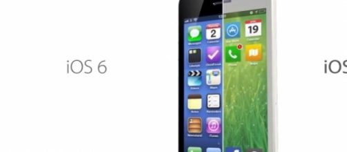
Can you notice what's common in new Apple's iOS 7, Windows 8 and all other leading UI platforms? There is only one word that describes the evolution of dot-com UI from early 2000 to iOS 7- Flat Design. Today, every piece of design is losing its 'Real Life' appearance and getting more and more flat and 'Digital'. The trend has recently become more prominent as iOS shed its skin to new flat iOS7 (the operating system is now on version 8.2.).
The trend in a nutshell
Before we move on to the comparisons and trend analysis, let's understand the basics first. Skeuomorphism - It's the practice of adhering to real life appearance while designing Graphical User Interface (GUI). Wikitionary defines it as "The practice of incorporating obsolete or skeuomorphic elements into a design, for familiarity or out of tradition, even though they no longer serve any functional purpose." It has long ruled the web world as these designs are supposed to be intuitive and user friendly. This is the reason why your notes app might have lines like a real world page, the music app has volume control panel just like your old radio and your camera still makes that shutter snap.
Distinct properties of skeuomorphismic designs
· The designs seem to have a depth
· Use of multi-color gradient
· The design looks more like a photo
· Prominent use of shadow, reflects and glossy effect.
Flat design resembles to a notice board filled with sticky notes. It's a symmetrical layout and each piece is a part of systemic flowchart. Icons are laid out in a grid and often with no glossy and shadow effect.
Distinct properties of Flat Design
· No depth effect
· Single or 2 color pallet
· Prominent use of vibrant/pastel colors
The origin
According to a popular notion, the trend in architectural design has greatly influenced the GUI. As sculptures and 3D designs are almost vanished from modern architecture, the trend seems to have affected on the GUI the same way. As our apartments are becoming flatter and minimalist, we want to see the same on screen too.
Minimalism - flat design's true companion
With our UI losing its 3D appeal, it's been more chronological in nature.
Minimalism is the product of our desire to browse sheer content. It's achieved by breaking things down to the barest elements required to make a whole design function. The Wave of minimalism rides on a single idea - 'Less Is More'.
Flat Design and Minimalism - Screen and beyond
We can see our flat screens going thinner every year, furniture going rectangular, 'Minimal music' getting popular and 'Literary Minimalism' could be observed in every other website. The Future of Minimalism seems no minimal whatsoever!
© ALL RIGHTS RESERVED

